
Two-Column Resumes? Here's Why ATS Systems Still Flag Them
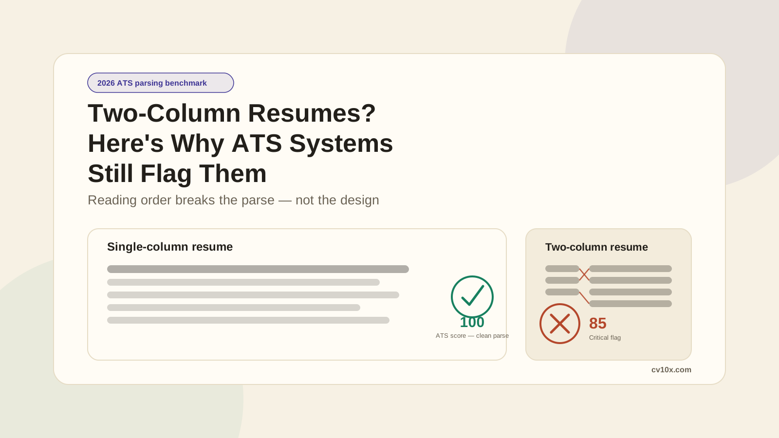
Why Two-Column Resumes Still Get Flagged by ATS Systems
Many resumes look impressive but still fail at the first technical step: parsing by an Applicant Tracking System (ATS). One of the most common reasons is a format choice that looks completely harmless: the two-column layout.
A sidebar for skills and contact info next to a main column for experience may look modern and well organized. But for ATS software, that structure can scramble reading order, break field extraction, and weaken keyword matching confidence.
If your goal is interviews, not just aesthetics, this is a formatting risk worth understanding before you submit.
The Hidden Tradeoff: Better Design vs Better Parsing
Modern resume templates often prioritize visual appeal:
- a sidebar for skills and contact details
- a separate column for experience and education
- icons or dividers separating the two
- graphic timelines running down one side
These elements can improve visual style for a human reviewer. The problem is that ATS parsing is not visual. It is text extraction and sequence recognition.
When a parser reads your file, it does not "see" your layout the way a recruiter does. It reads the document as a single stream of text, left to right, top to bottom. That is where two-column layouts introduce ambiguity.
How Two-Column Layouts Damage ATS Scoring
1. Reading Order Gets Scrambled
This is the core failure mode. Instead of finishing your sidebar column and then moving to your main column, many parsers read straight across the row, pulling a line from the sidebar and a line from the main column together as if they were one sentence.
In controlled testing, a two-column layout was the only format (out of six tested) to trigger a critical parsing flag, dropping its score from a clean 100 to 85. The words were all still there. The order was not.
2. Contact and Header Fields May Get Skipped
When contact information sits in a narrow sidebar block rather than a standard header line, some parsers fail to map it to the right fields. That can mean:
- your phone number not recognized as a phone number
- your email parsed alongside unrelated sidebar text
- contact fields left blank in the recruiter's system
If your contact data isn't extracted reliably, your resume can appear incomplete before anyone reads a word of it.
3. Keyword Matching Weakens
ATS ranking relies heavily on keyword signals in clear, sequential text. When your skills column is being interleaved with your experience column, the surrounding context around each keyword gets muddled.
That matters because ranking systems weigh keywords partly by where and how they appear. Scrambled context means weaker matching confidence, especially in stricter filters.
4. Section Labels Lose Structure
Two-column resumes often place headings like "Skills" or "Certifications" in a sidebar disconnected from the content a parser expects to follow it. ATS systems work best with section labels that sit directly above the content they describe, in a single reading path:
- Experience
- Education
- Skills
- Certifications
When structure confidence drops, overall ATS compatibility usually drops with it.
5. Export Format Adds Extra Risk
Even a well-designed two-column resume can behave differently depending on how it's exported. A layout built with tables or text boxes purely for visual placement often has no real relationship between the underlying text order and what a person would read. A layout where the columns are cosmetic but the text underneath is still encoded in a clean, linear order tends to survive parsing far better.
The catch: as a candidate, you usually have no way to check which kind you've built, and no way to know which parser is waiting on the other end.
"But Two Columns Make My Resume Look Better"
True. They often do.
But the resume pipeline is sequential:
- ATS parsing
- ATS ranking/filtering
- human review
If you lose at step 1, visual polish at step 3 does not matter.
The most effective approach is machine-first clarity with human-friendly readability. You can still have a strong-looking resume without a layout that introduces parsing risk.
ATS-Safe Alternatives That Still Look Professional
Use this instead of a two-column layout:
- A single header block with your name and contact details, left-aligned
- Sections stacked top to bottom: Summary, Skills, Experience, Education
- Bold section headings instead of sidebar boxes to create visual hierarchy
- Whitespace and font weight to separate sections, not column position
For skills, group them as plain, linear text instead of a sidebar list:
- Languages: Python, SQL, JavaScript
- Data: Tableau, Power BI, Excel
- Cloud: AWS, GCP
This keeps the same information dense and organized, without asking the parser to reconstruct two separate reading paths.
Quick Before/After Example
Risky Version
Two visual columns side by side:
[ Sidebar ]              [ Main Column ]
Skills                    Summary
Contact Info              Experience
Languages                 Education
The parser may read straight across each row instead of down each column, mixing "Skills" content into your "Summary" or "Experience" text.
ATS-Safe Version
One linear column, top to bottom:
Contact
Summary
Skills
Experience
Education
The second version gives the parser one clear path to follow, and it's just as readable, if not more so, for a human.
Practical Rules to Follow
- Default to a single-column layout for any resume going through an online application portal.
- Keep contact info in a plain header line, not a sidebar block.
- Use standard section headings placed directly above their content.
- Avoid tables and text boxes to create visual columns.
- Save visual styling for spacing, bold text, and typography, not layout splits.
- If you must use two columns, export the file and check that the extracted text still reads in the correct order.
Why cv10x Still Flags Two-Column Resumes
You don't get to choose which ATS a company uses, which version they're running, or how carefully their recruiting team configured it. A well-funded company might be on a modern setup that handles columns gracefully. A smaller company might be running something years older. From the outside, there's no reliable way to tell.
That uncertainty is why cv10x treats two-column layouts as a risk factor, not an automatic failure. It's not that two columns are always broken, it's that they introduce a variable you can't verify and don't need to take on. A single-column resume removes that risk entirely, at the cost of a little visual flair. For most online applications, that's a trade worth making.
Final Takeaway
Two-column resumes are not always catastrophic, but they are unnecessary ATS risk. When competition is high, a scrambled reading order can be the difference between being surfaced and being filtered out.
A resume that is simple, linear, and text-forward will usually outperform a more decorative version in ATS environments. If you want more interviews, prioritize clarity over layout.
Good design should support readability, not compete with machine parsing.
FAQ: Two-Column Resumes and ATS Scoring
Do two-column resumes hurt your ATS score?
Often, yes. Two-column layouts can break the reading order ATS systems rely on for keyword matching and field recognition. In controlled testing, a two-column layout was the only format out of six that triggered a critical parsing flag.
Can any ATS parse a two-column resume correctly?
Some can, depending on the specific parser, its version, and how the file was built. But there's no reliable way to know which kind of system a given employer is running, which is why single-column remains the safer default for online applications.
What should I use instead of a two-column layout?
Use a single, linear column with a plain header for contact details and standard section headings like "Experience," "Skills," and "Education" stacked top to bottom. This gives the parser one clear reading path.
Which ATS systems struggle with two-column resumes?
Most major ATS platforms, including Workday, Greenhouse, Lever, iCIMS, and Taleo, can struggle with column-based resume formats depending on configuration. The safest approach is to assume any ATS may have difficulty and format accordingly.
Can I still make my resume look good with a single column?
Absolutely. Strong visual design comes from clean typography, consistent spacing, bold section headings, and good use of white space, not column splits. ATS-safe resumes can look polished and professional.